Remember we talked a bit about color theory here, dear readers? As promised, today we'll follow-up with a drive-by discussion of the psychology of color, which is equally important.

We're told that, "color psychology is the study of color as a determinant of human behavior. Color influences perceptions that are not obvious, such as the taste of food. Colors can also work as placebos by having the color of pills be certain colors to influence how a person feels after taking them. For example, red or orange pills are generally used as stimulants. Another way in which colors have been used to influence behavior was, in 2000, when the company Glasgow installed blue street lights in certain neighborhoods which resulted in a reduced crime rate. Color can indeed influence a person, however it is important to remember that these effects differ between people. Factors such as gender, age, and culture can influence how an individual perceives color."
I'd definitely agree with that, do you? Take a look at the spectrum wheel above (and take it with a grain of salt). It's an interesting image tying together colors with emotions. Some of these tie-ins seem obvious - thinking about a beautiful light blue ocean can make you feel calm, orange traffic cones can make you feel anxious, remember the expression "seeing red" when talking about someone being angry? Some of these are cultural cues, some are perhaps ingrained and some are quite possibly nonsense.
Did you know that blue is the top choice for 35% of Americans, followed by green (16%), purple (10%) and red (9%)? Some other fun color facts are that a preference for blue and green may be due to a preference for certain habitats, color preference may depend on ambient temperature, research has concluded that women and men respectively prefer "warm" and "cool" colors, studies have shown that cultural background has a strong influence on color preference, children's preferences for colors they find to be pleasant and comforting can be changed and can vary, while adult color preference is usually non-malleable. Some studies find that color can affect mood (ever notice that hospital walls are almost always extremely neutral?). However, these studies do not agree on precisely which moods are brought out by which colors.
Keeping all this in mind, let's apply what we know about the psychology of color to branding and marketing. Color is used as a means to attract consumer attention to a product that then influences buying behavior. Color name can also matter (what sounds better: "I bought a red car" or "I bought a lipstick red car?"). I find this graphic fascinating:
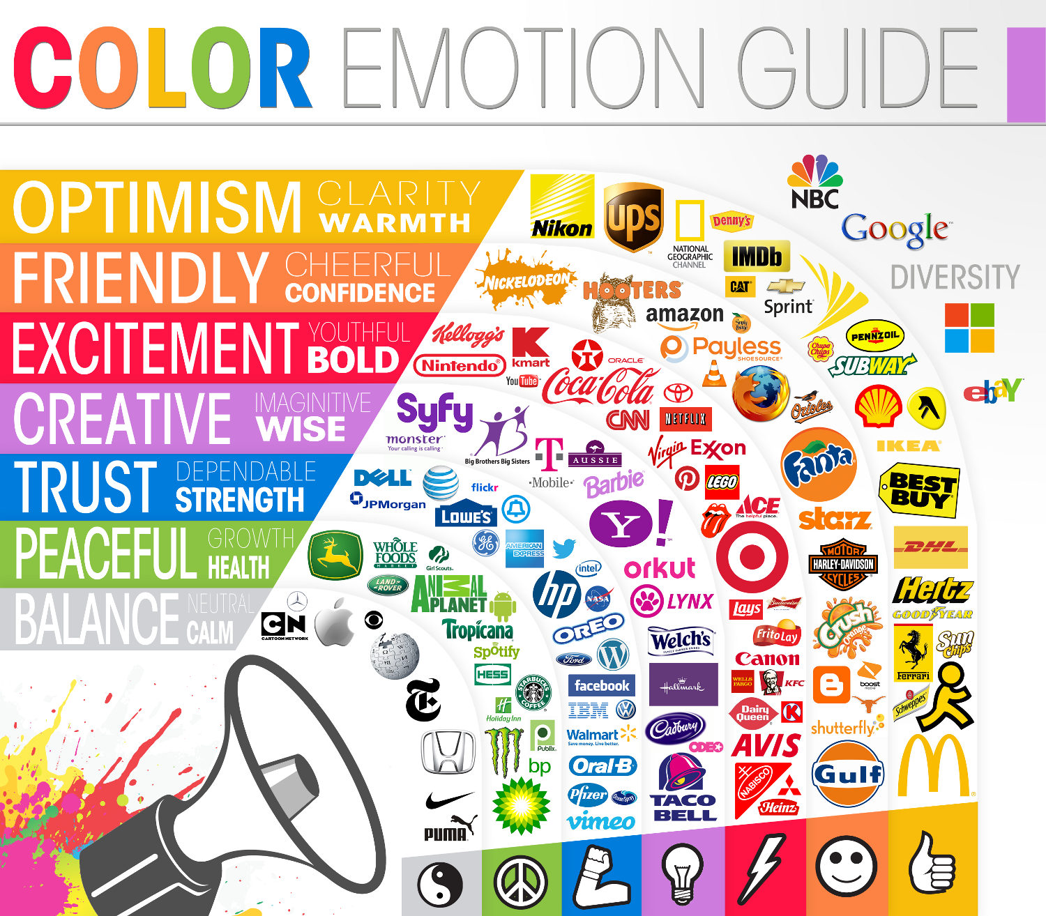 Makes sense now, correct? Trying to drive the point home that your company or brand is eco-friendly? Using green is an obvious choice. Hoping to stand out and cater to a perhaps younger audience? Bring in the red. Want to convey that you are a lasting brand, one with history and dependability? Everyone loves blue. Companies spend billions on branding and marketing. There isn't some person sitting in a room somewhere making doodles for logos - they're incorporating market research, company identity, visibility, whom they want for their target audience and, you guessed it, color psychology.
So how can we bring all this information over to our knitting and apply it? We don't even need to be talking about Fair Isle, intarsia, mosaic or any other type of color work knitting - we could be talking about a simple, monochrome ribbed scarf. Color matters. It seems like an obvious statement, but if your goal is to design an ethereal lace shawl inspired by the forests of Iceland, you probably don't want to cast on with orange or red. That being said, there is of course a flip-side where sometimes the color of the yarn dictates the design. I found myself purchasing 2 hanks of crazy variegated yarn recently that part of my brain said "this is not your thing, Tanis, step away" while the other part (that eventually won out) screamed "bring me home with you, Tanis! I'm gorgeous!" I knew the crazy variegated was destined to live its life as mostly garter stitch - and I was fine with that because in this particular case, it was about the color, not the design. What do you want your design to convey? Maybe it doesn't matter to you and you just want to knit a beautiful shawl - and that's fine!
One of the most amazing things about knitting is that we create every single stitch. We literally take string and turn it into something wearable and useful. How great is that? Color psychology adds an additional layer to our knitting and it can enhance a design, hinder it (ever knit lace with a highly contrasting variegated?), add emotion or mood, blend in by being neutral or proclaim to the world "THIS IS MY KNITTING AND I LOVE GREEN!"

So next time you stash dive or head over to your LYS, don't just settle on a color. Cast on with intent and thoughtfulness towards your design. Give color a voice - listen to it, respect it, apply it and enjoy it. There are no right or wrong color choices - at the end of the day I think it's mainly personal preference that makes a person choose one color over another. How those preferences came about is another story, but go to your LYS and look around with fresh eyes. You might surprise yourself with what you reach for!